Alphabet Project:
Advanced Typography Project
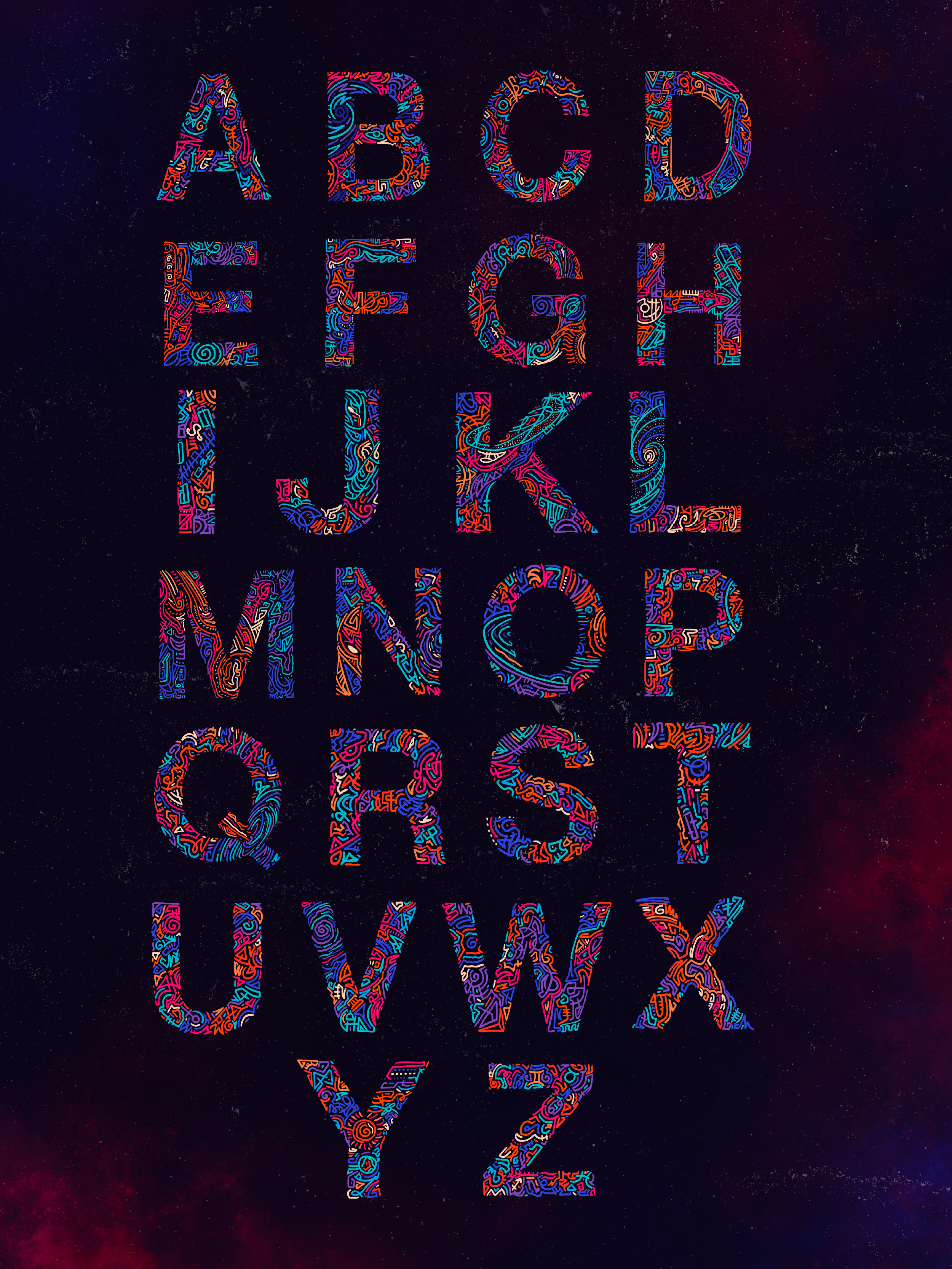
For our first project in my Advanced Typography, we were tasked with creating the alphabet using our custom typography. The goal was for us to have a deeper exploration into the origins and popularity of creating different fonts. This gave us the unique challenge of using our creative styles and pushing the norms for how that process has been done. The first thing we had to do was choose a theme we were most interested in.
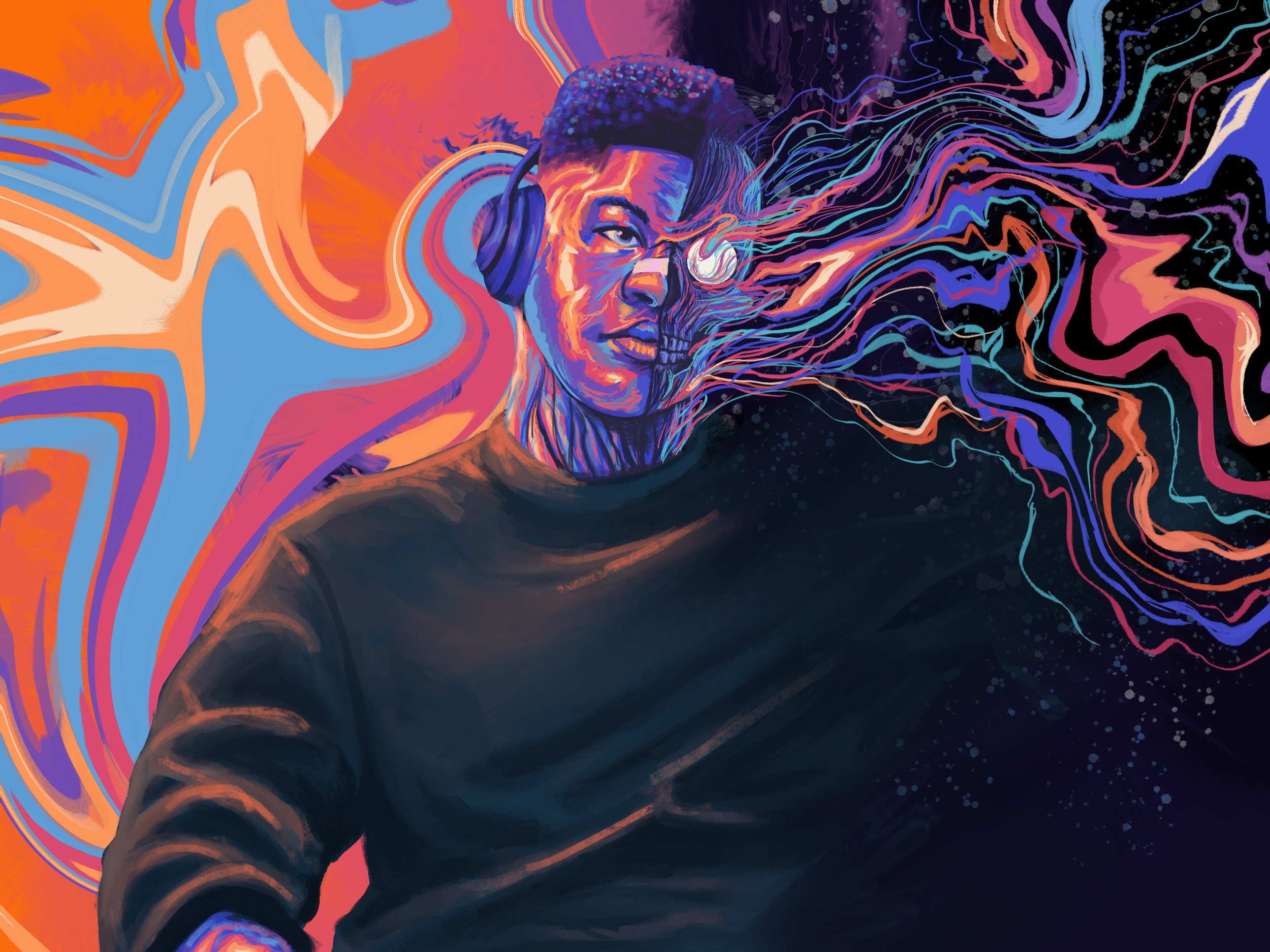
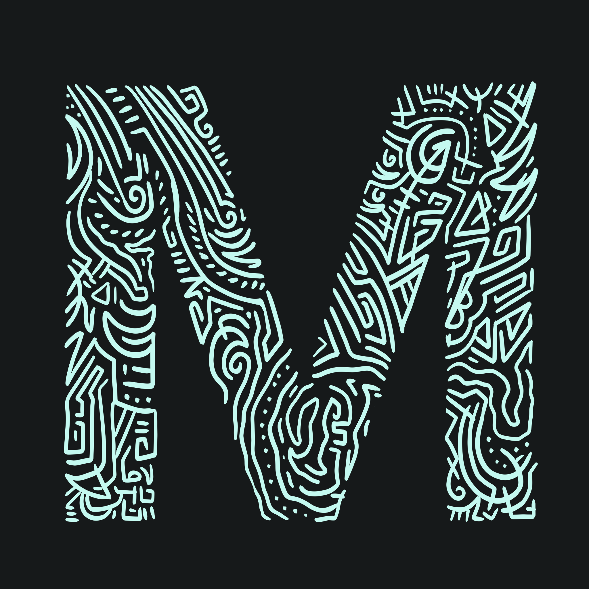
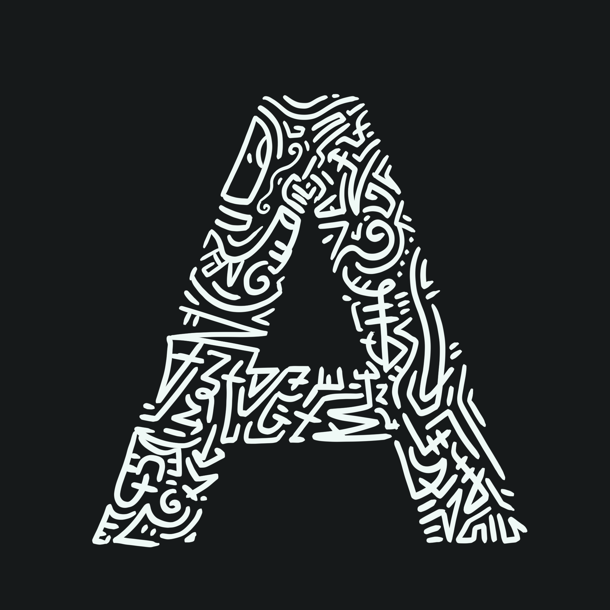
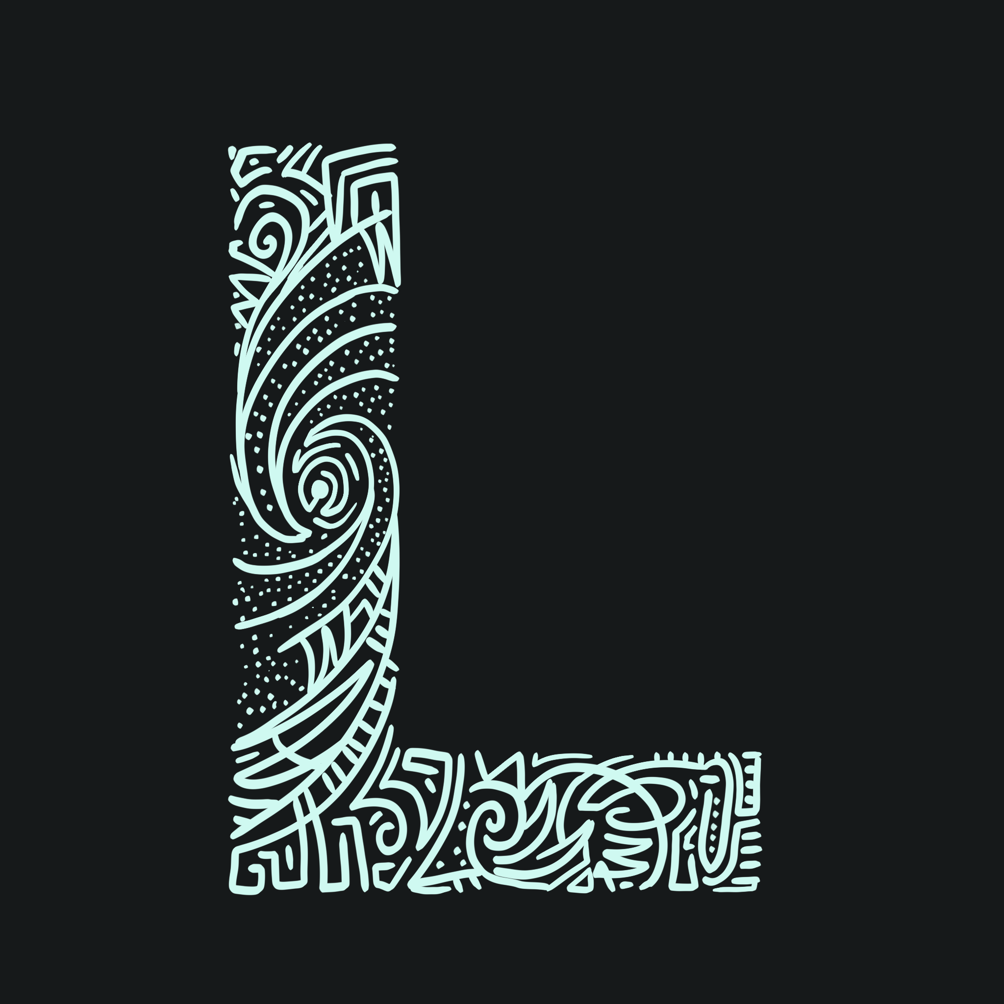
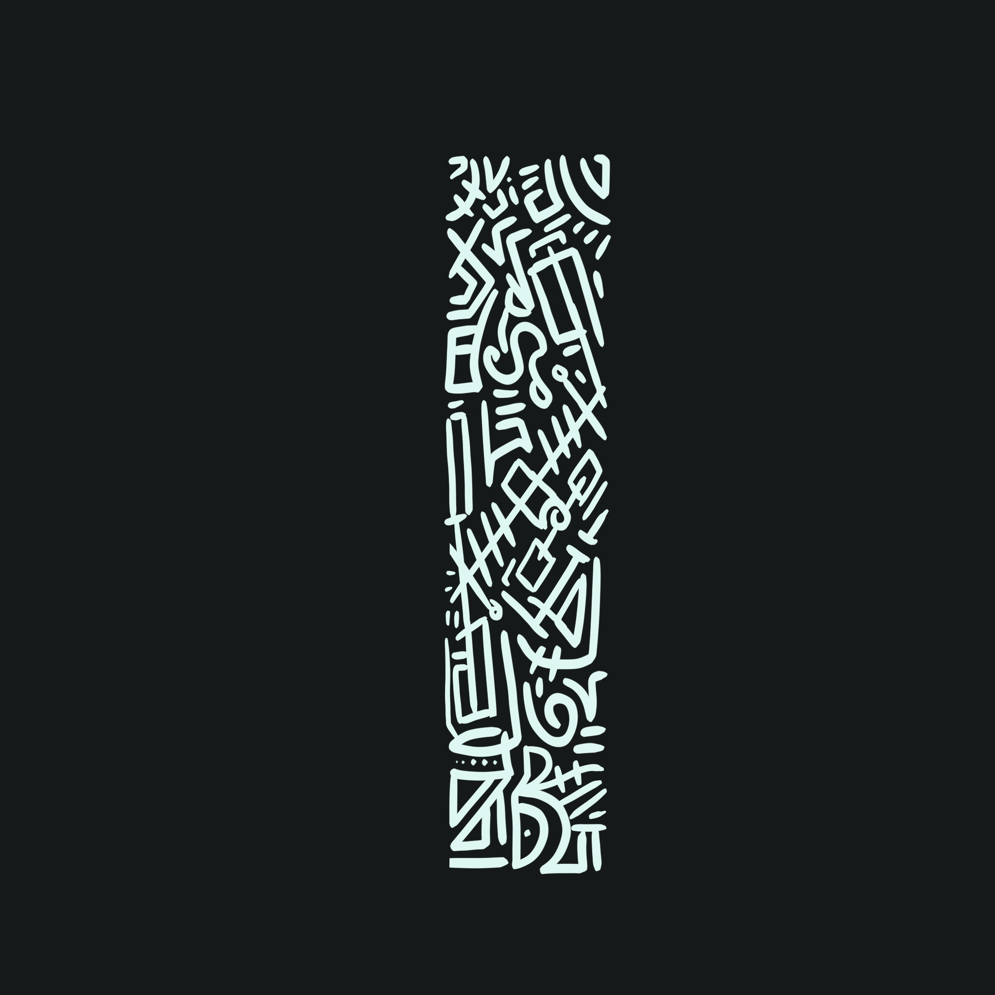
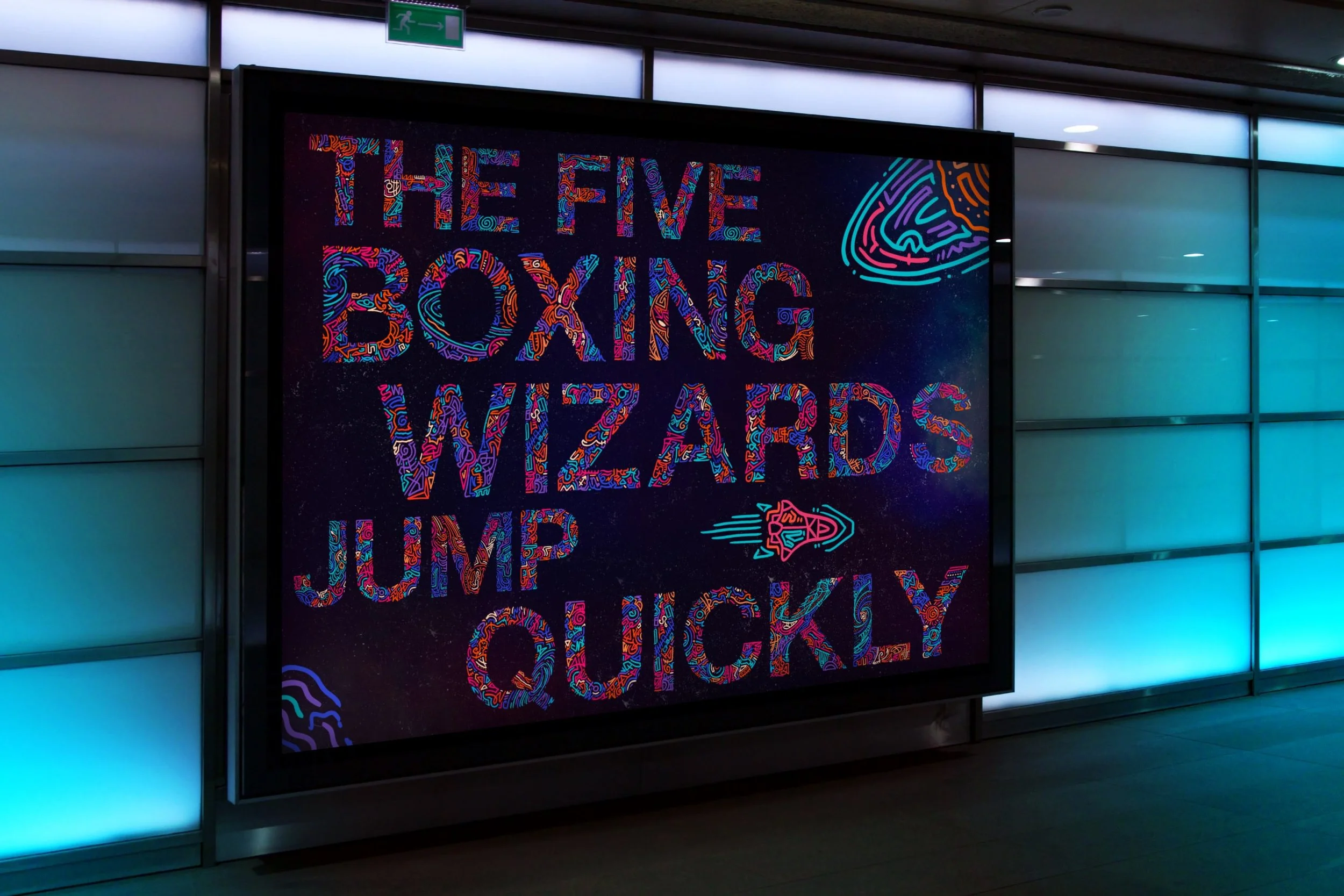
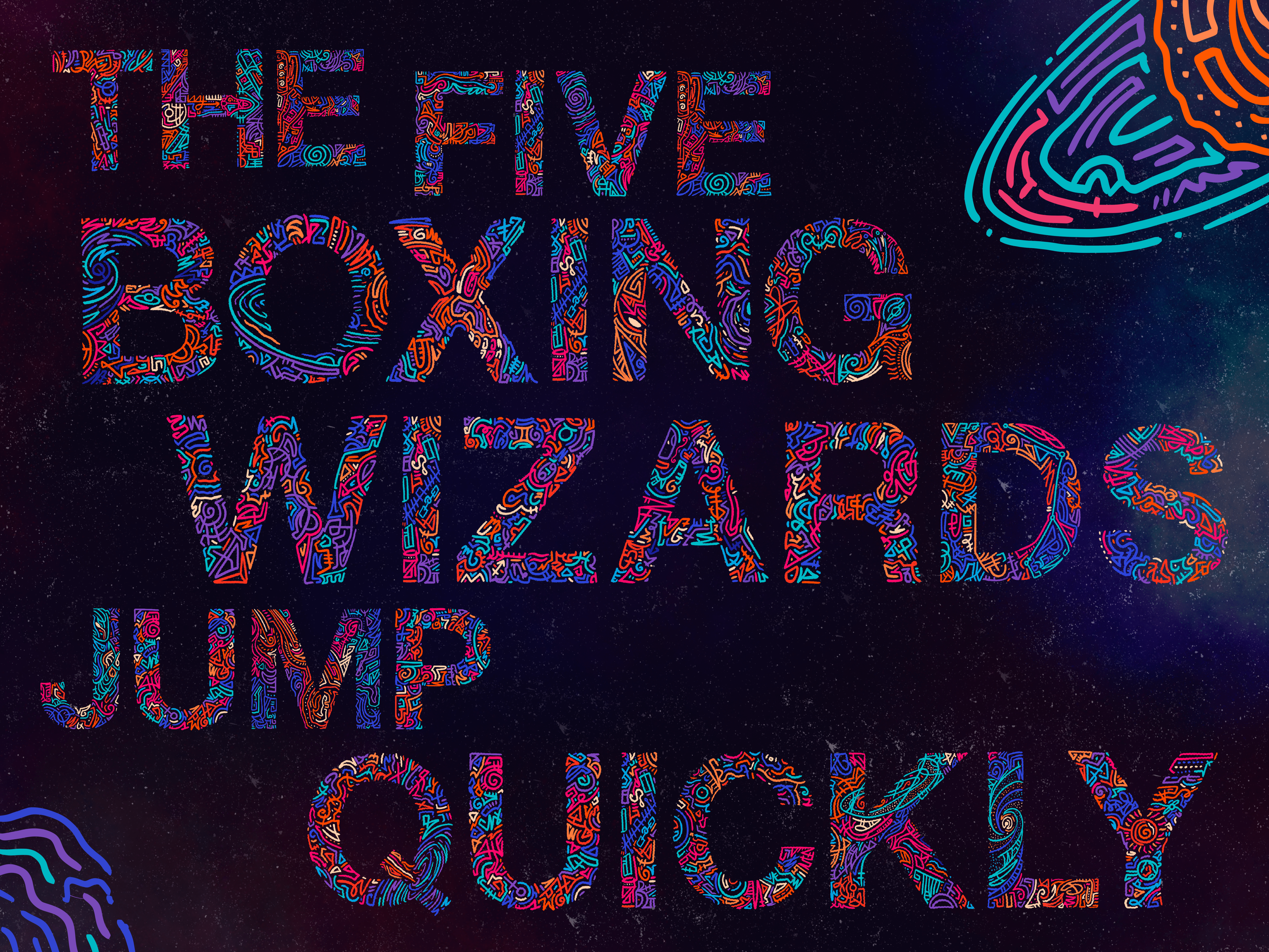
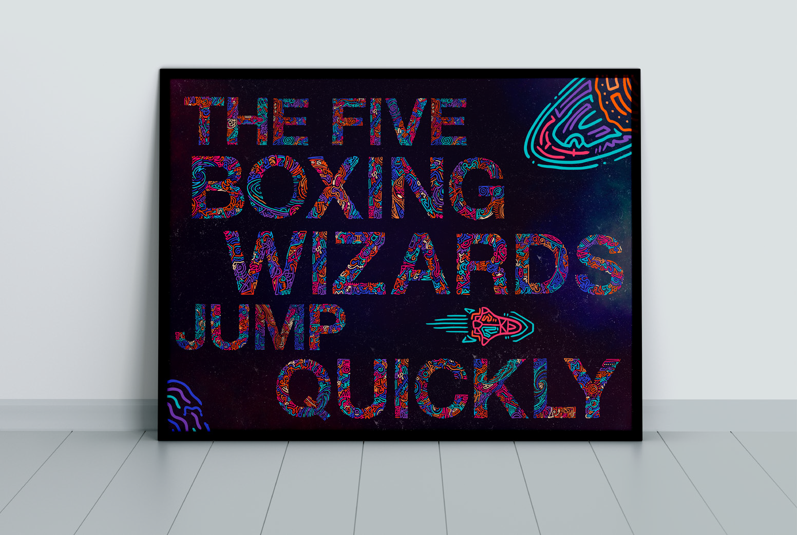
A year ago I worked on a series inspired by Kid Cudi’s MOTM3 and my love for outer space. I wanted to use the same color schemes and theme to create a custom type based on outer space.
CONCEPTS
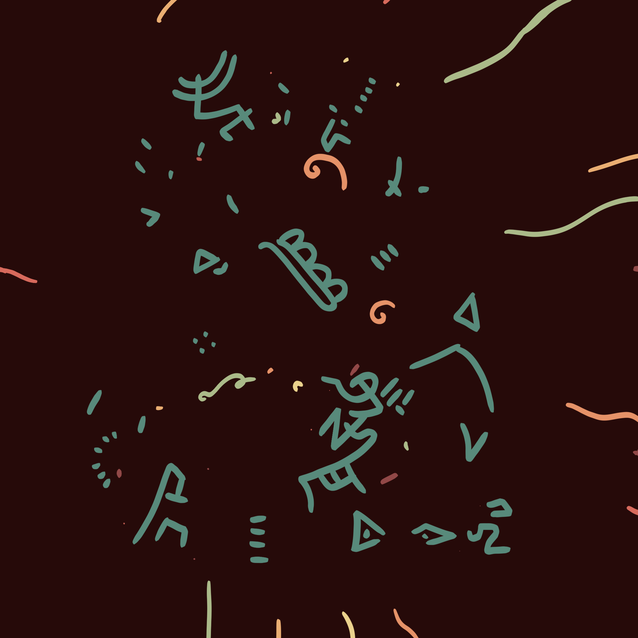
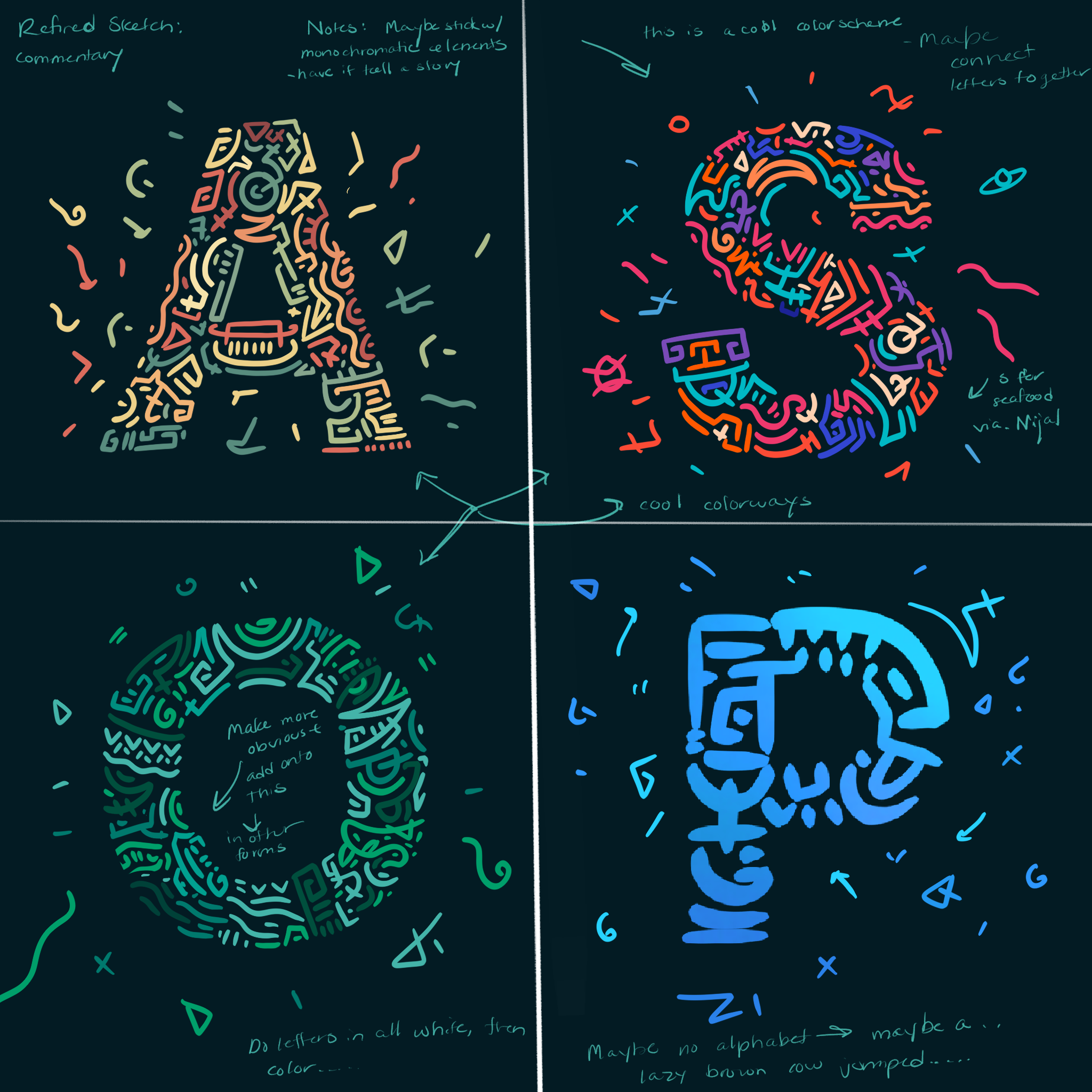
Before I chose outer space as a theme, I wanted to explore other options based on my inspiration haul. Some of the earlier explorations of the theme explore the same mark-making style in different colors, using Keith Haring art to make the letterforms, a nautical theme, and basic cooking items you’d use in your kitchen.
From the feedback, my mark-making style proved to be my strongest concept. I was encouraged to explore some other iterations of themes before I settled on the space theme. These concepts were fun to explore and gave me more practice with how far I can take this style.
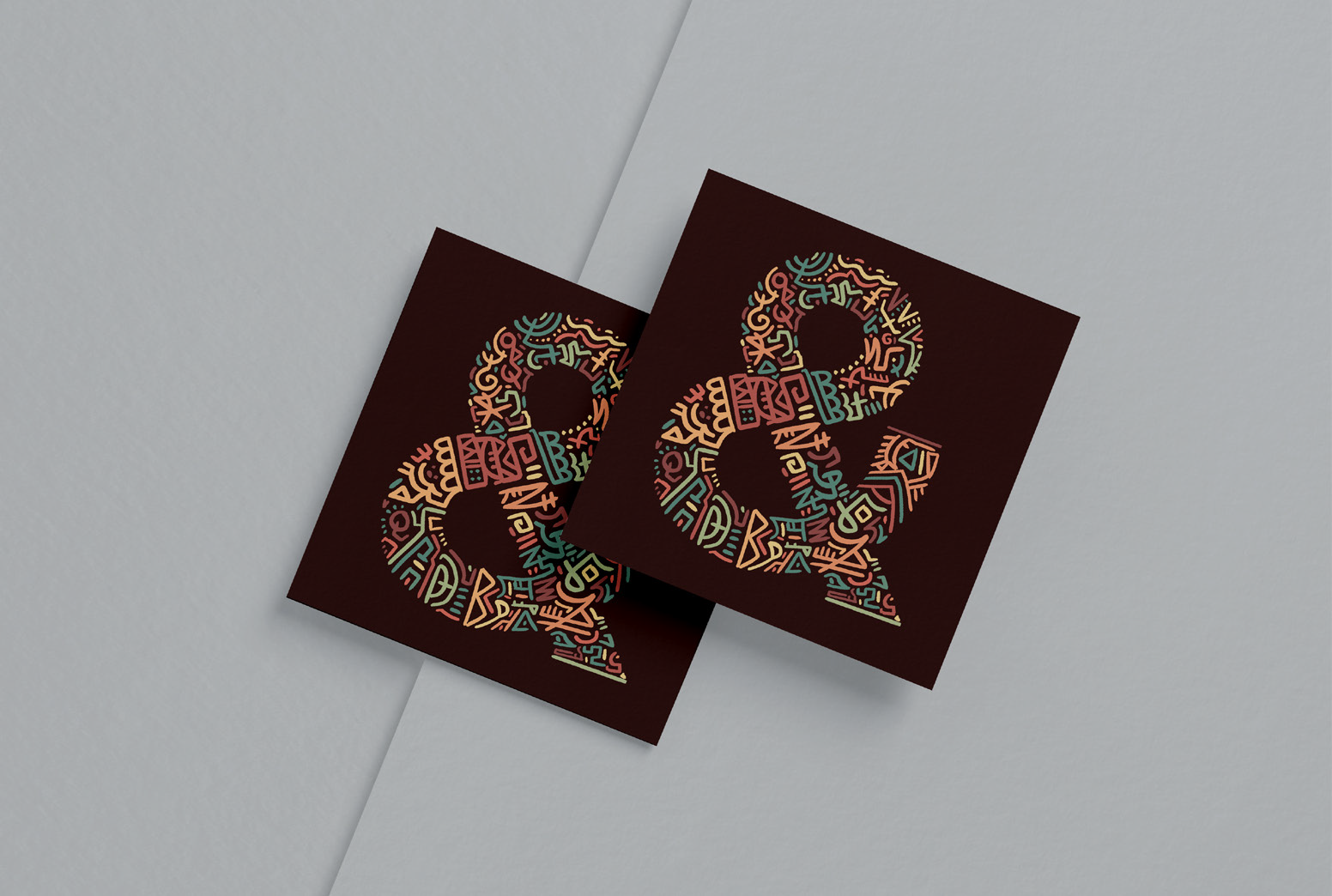
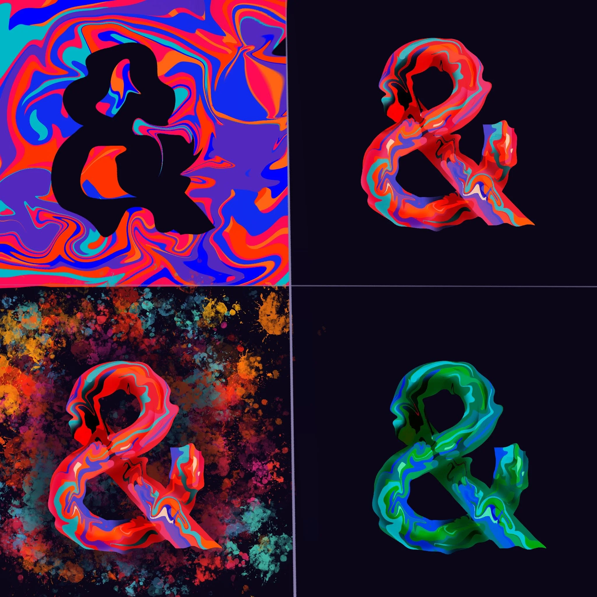
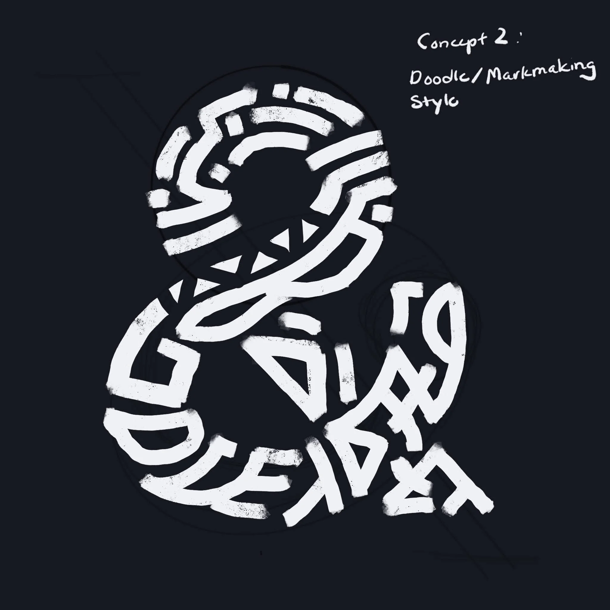
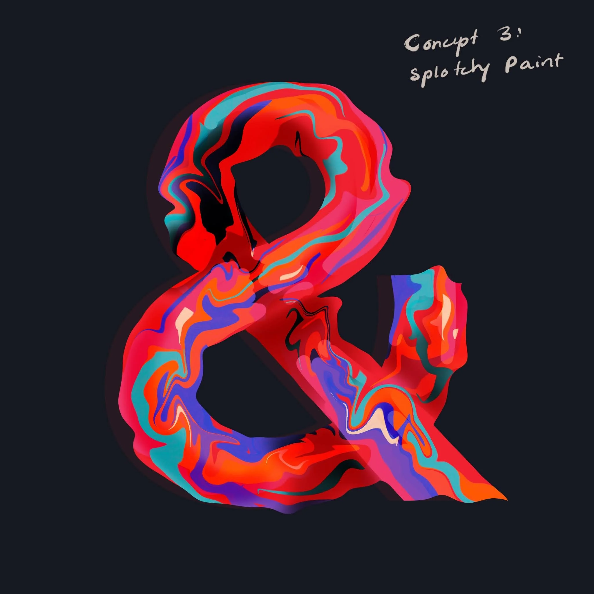
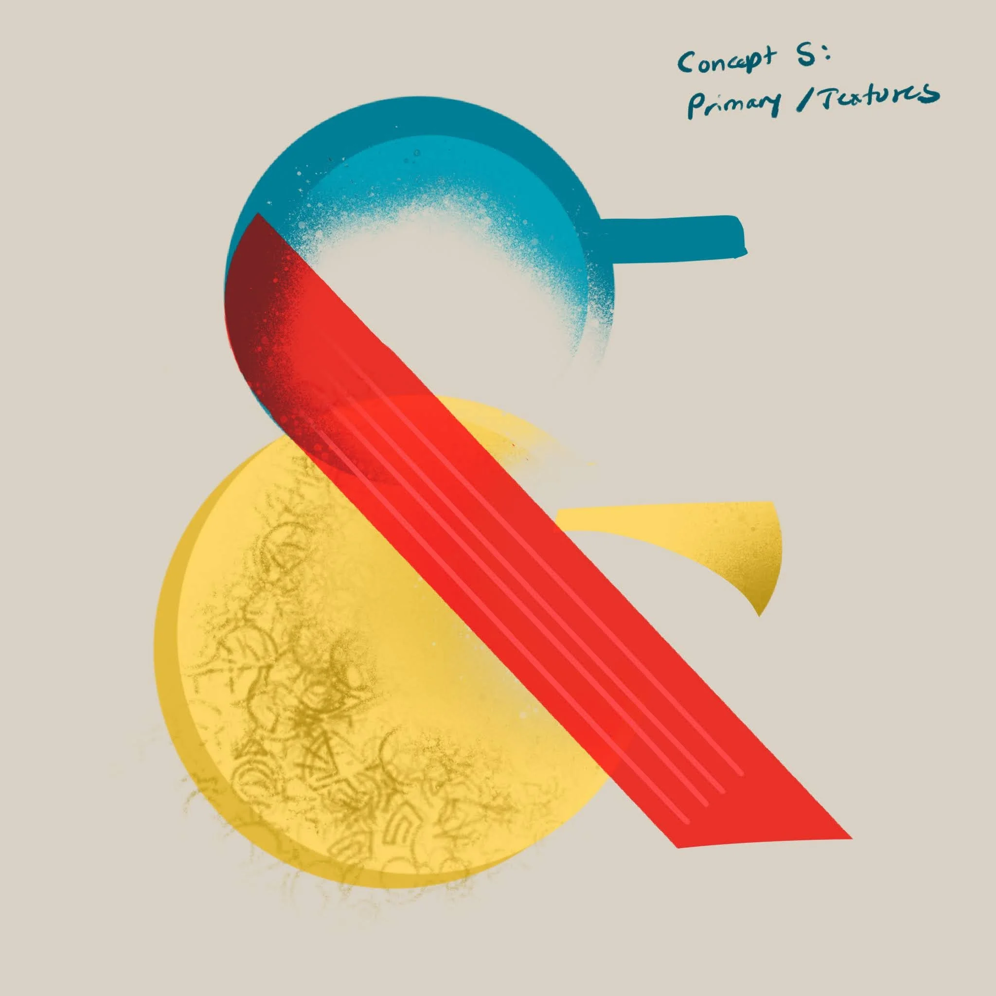
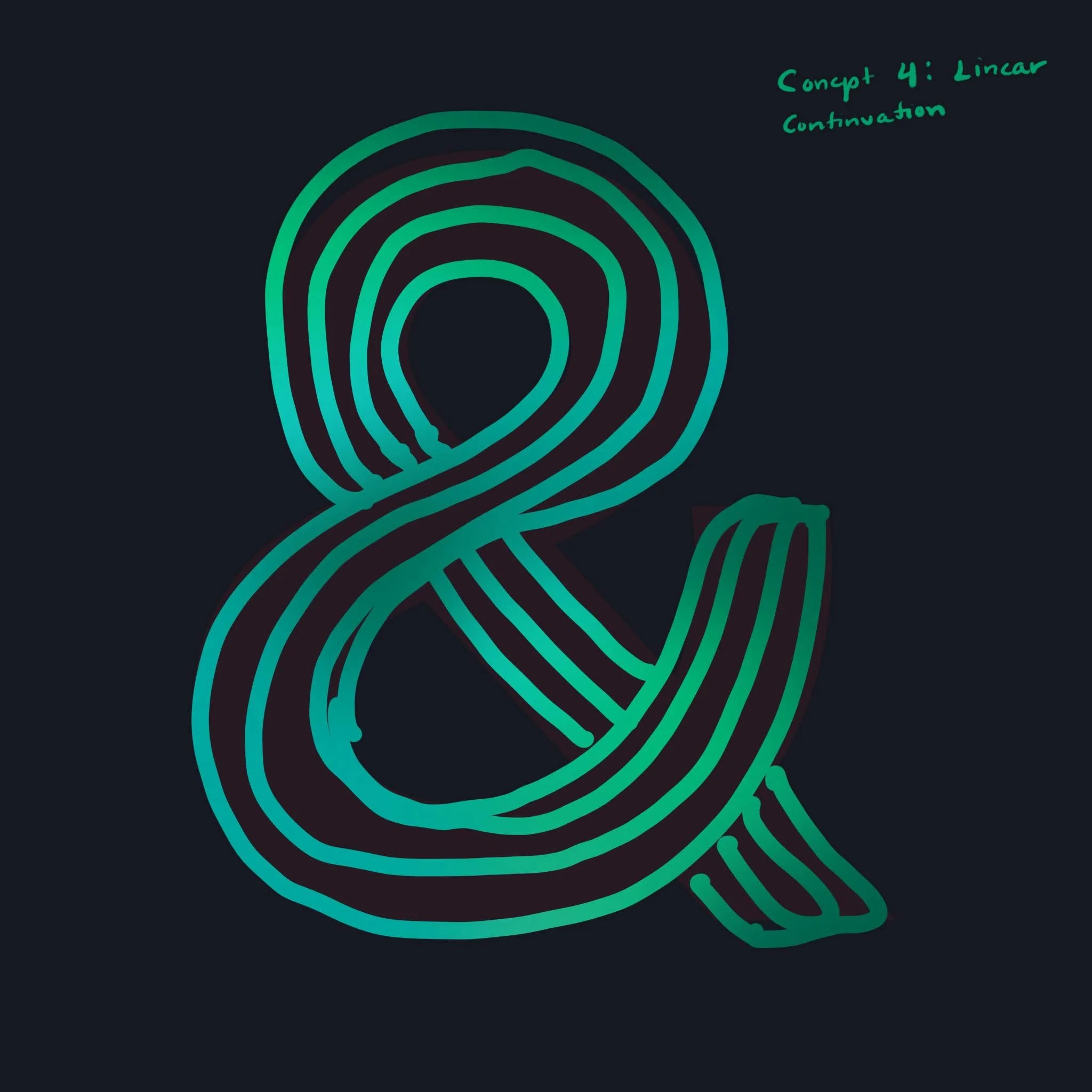
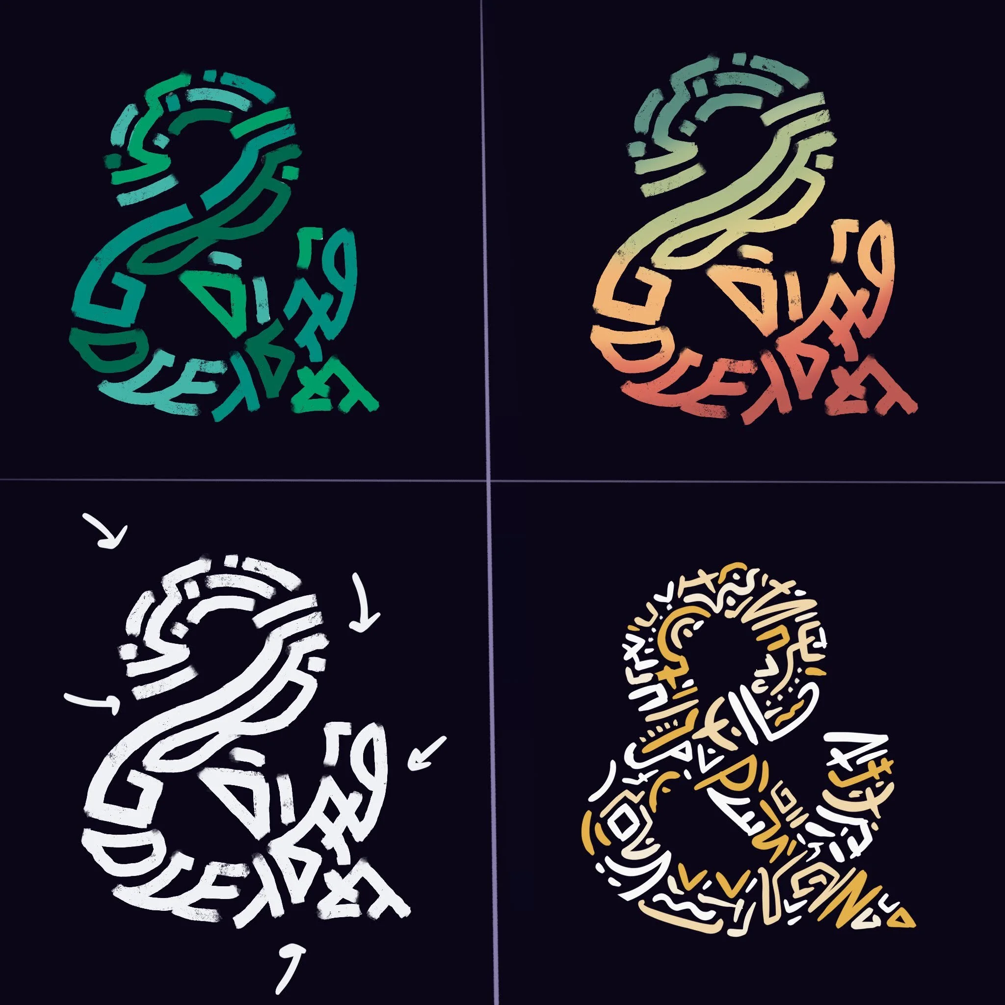
Ampersand Exercise
In addition to creating this project, we were tasked with creating an interactive ampersand animation. This exercise allowed us to explore various software that utilizes animation. This was the first time I worked with creating hand-drawn animation, in a similar style to Disney.
Some of the concepts I explored were using a similar style to what I chose for the alphabet, a play on primary colors and textures, wet paint, and a more linear progression with gradients. My strongest concept was my mark-making style and after exploring some iterations, I landed on the campfire-themed color palate to play with.

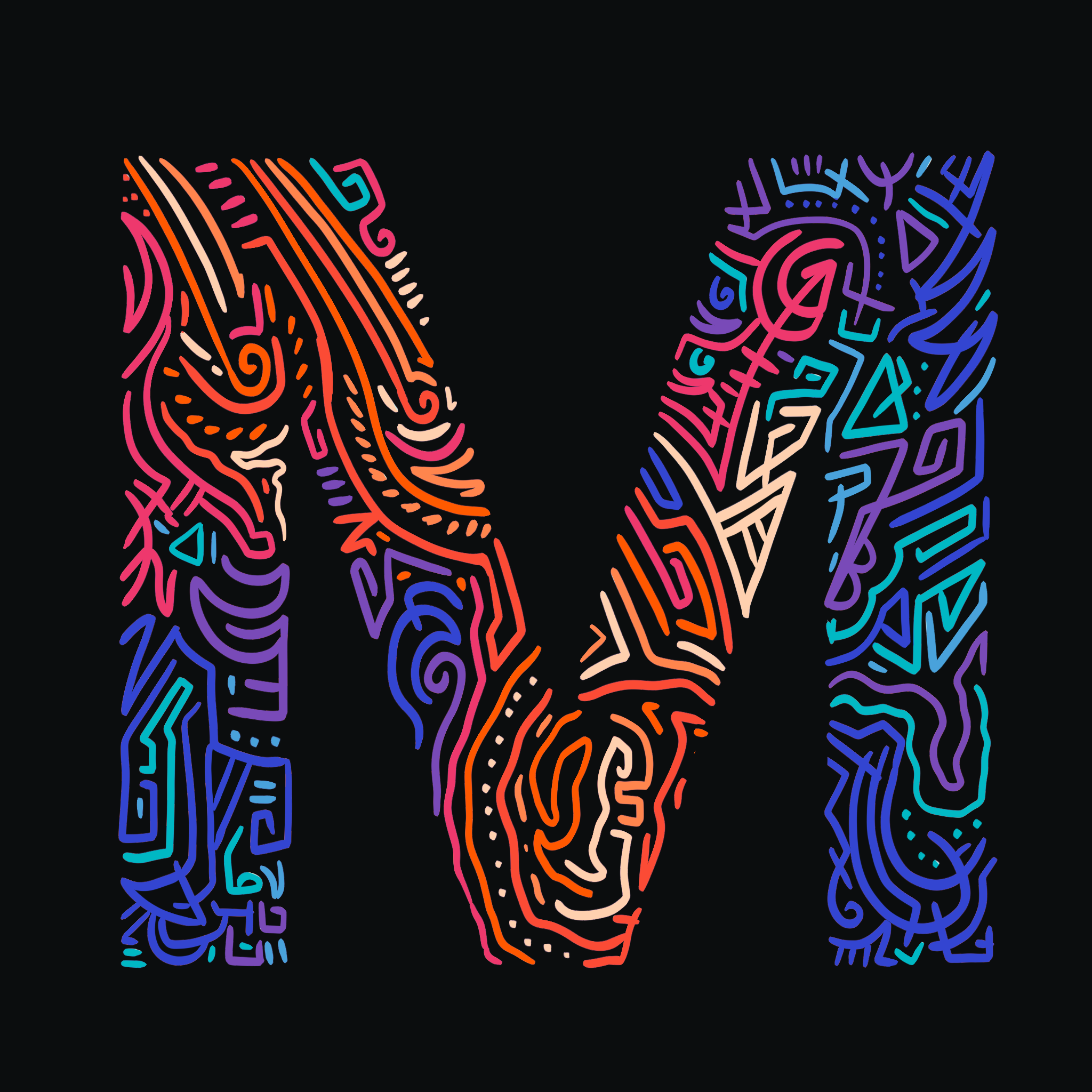
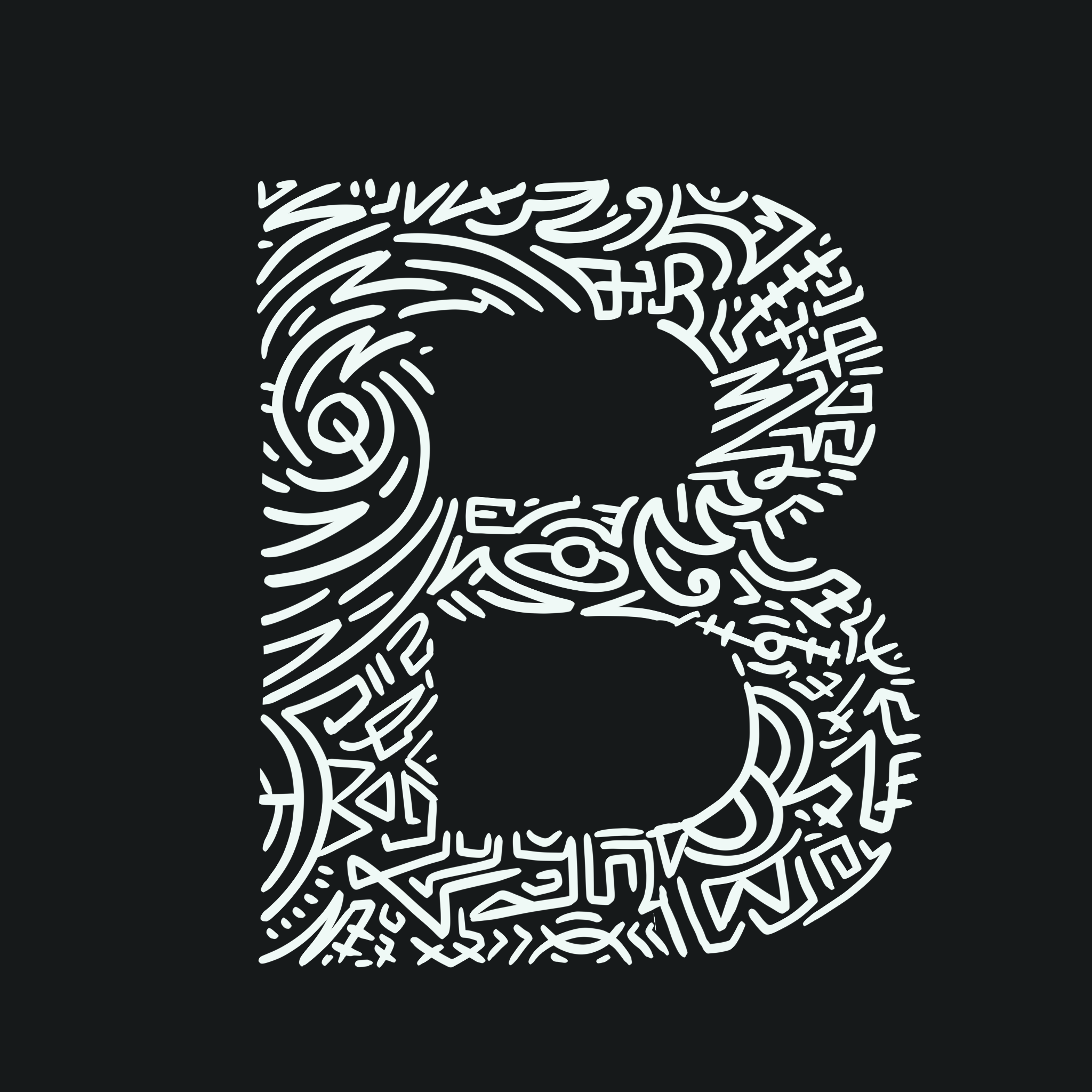
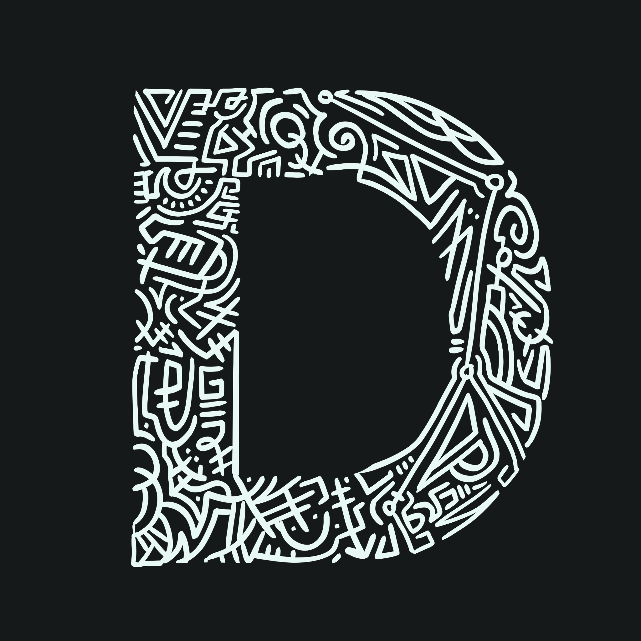
BUILDING THE ALPHABET
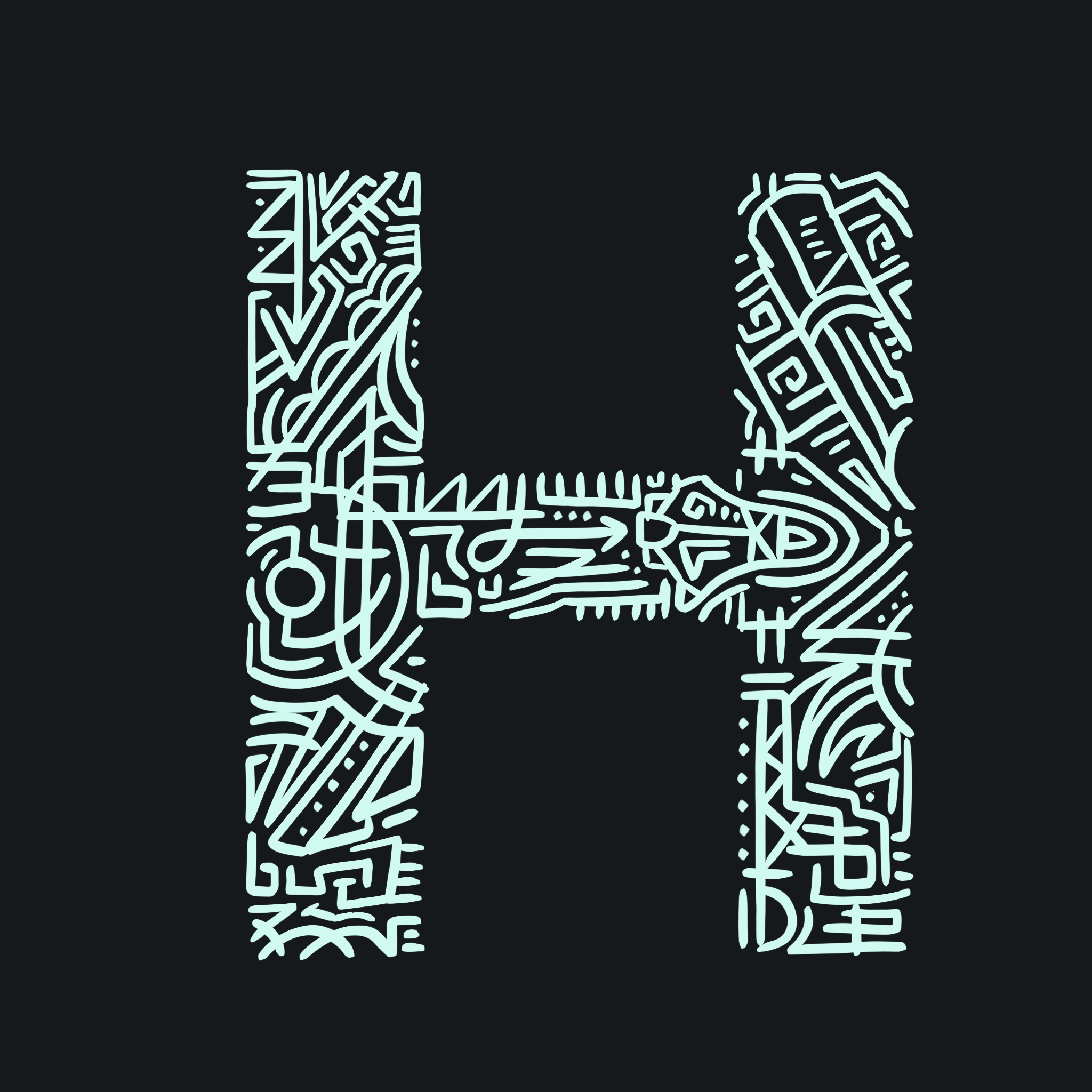
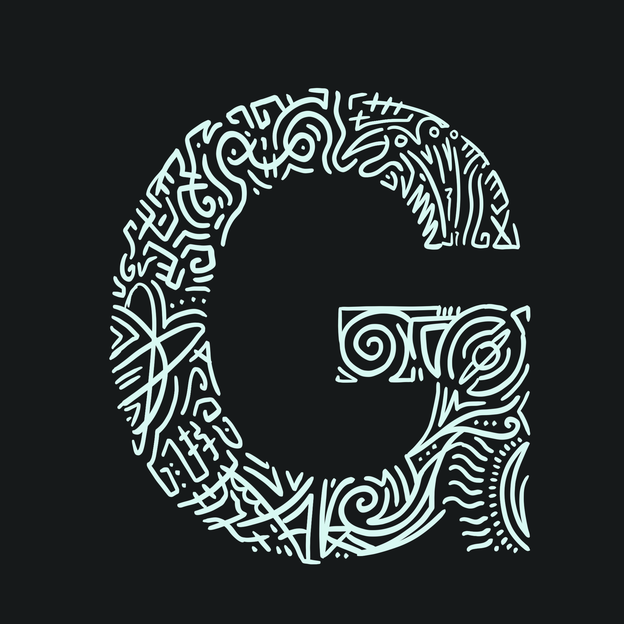
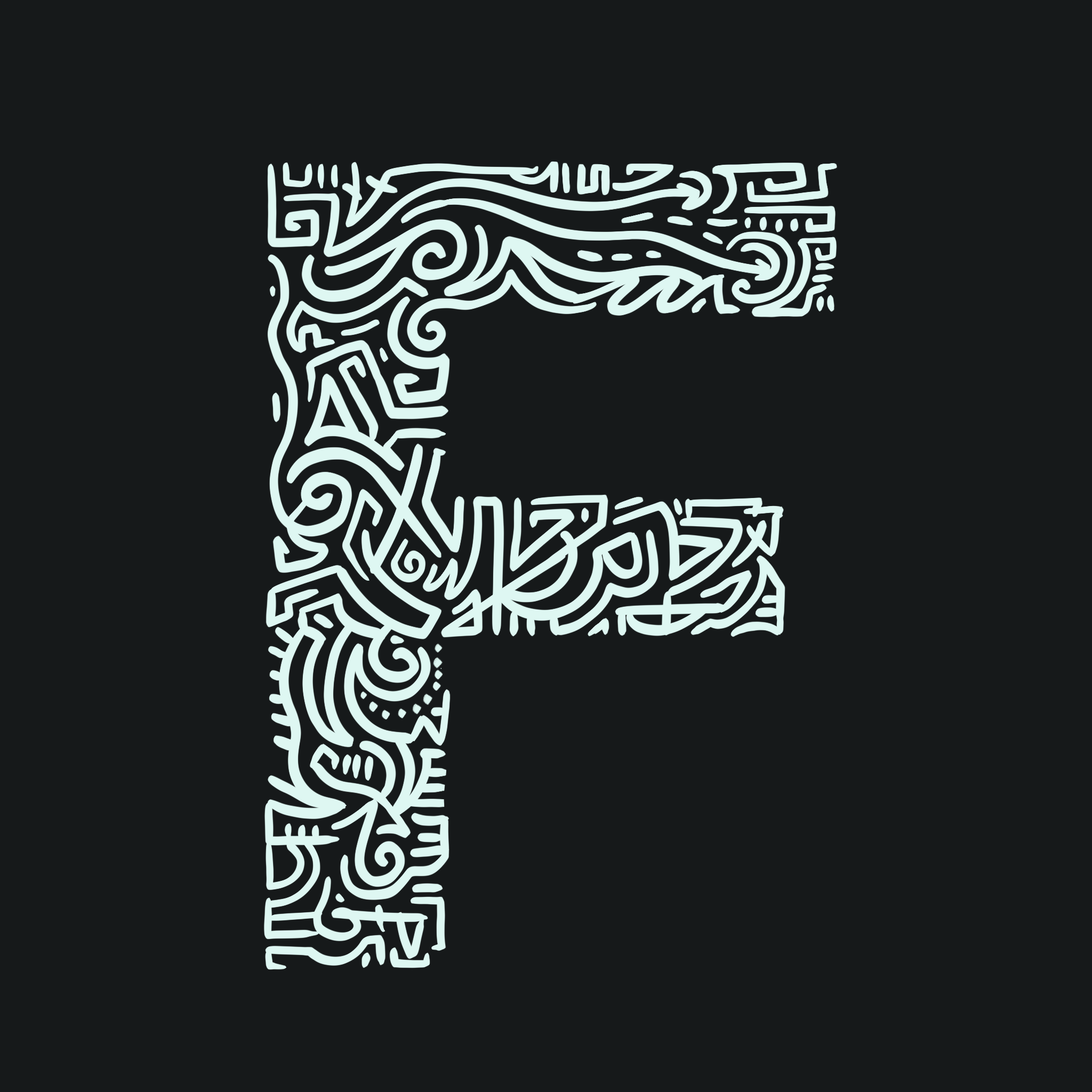
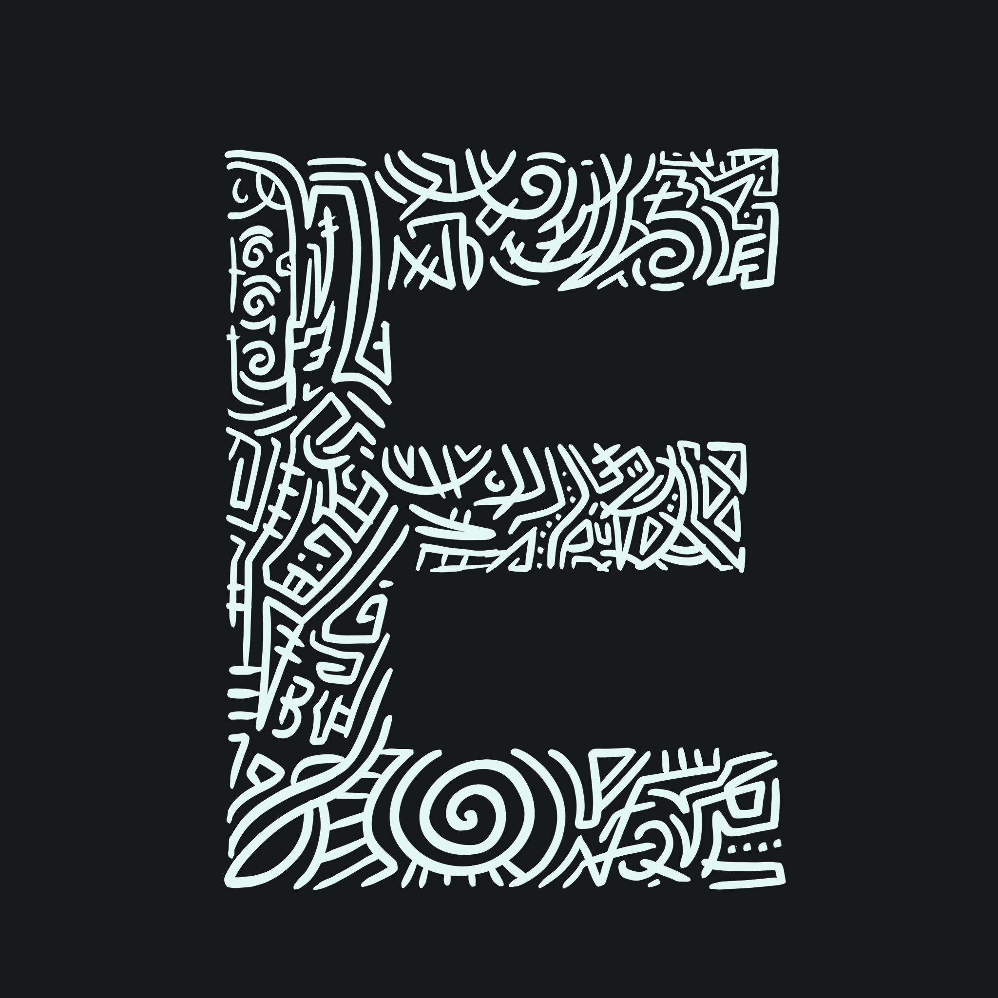
When creating the individual letters, I wanted to include some space-related images One of my favorite aspects of creating these letters was including easter eggs for people to view (ex. an Astronaut in the letter A, meteors in the letter M). I made sure the “easter eggs” stood out by tailoring my color scheme. I went with some pop-culture references for some letters, which was fun to design!


AMPERSAND ANIMATION

While the ampersand doodle was fun to make, animating it proved to be a tedious task. The challenge I ran into was animating every single element frame-by-frame. Many decisions about where the elements would come from were another challenge (did I want it to come from out of the frame or out of nowhere). In the final result, I was able to blend both decisions successfully. For the first time doing this, it wasn’t too bad!
FINAL ITERATIONS


AMPERSAND ANIMATION