Cascade Resort:
A Web Design Group Project
During the fall semester of my senior year, I had the opportunity to work with a group to create a service-themed website aimed at capturing a certain demographic. Our group wanted to present a modern resort based around the Lake Tahoe area for our area of focus. My group members were Hannah Lamotte, Asia Hunter, and Michael Kirchoffer
Planning Analysis
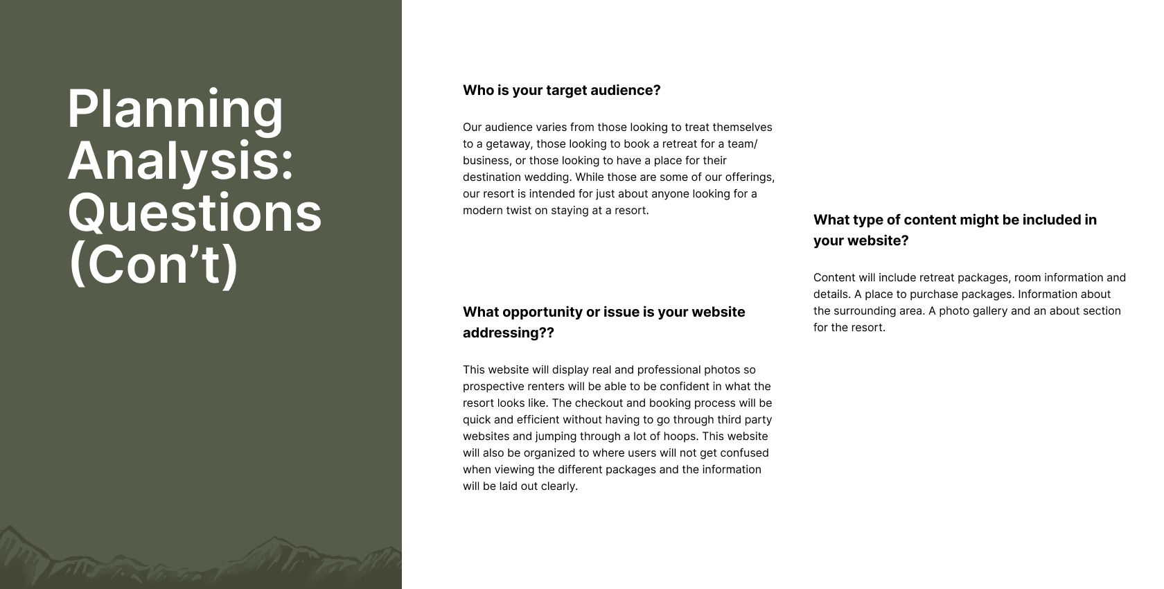
For most of our planning and development, we collaborated in Figma to get most of our ideas down. Below are our answers for the planning analysis.
In addition to answering these questions, we had to create user personas for the ideal audiences we would target. What was important in creating the personas was tackling their background, skills, needs, and pain points.
CONCEPTS
In the project progression, we each took shots at tackling the overall designs for the wireframes and logos. Collaborating and seeing how we could blend our design processes and skills was fun and allowed us to explore. Below are some of the sketches and rough drafts:
Wireframes:
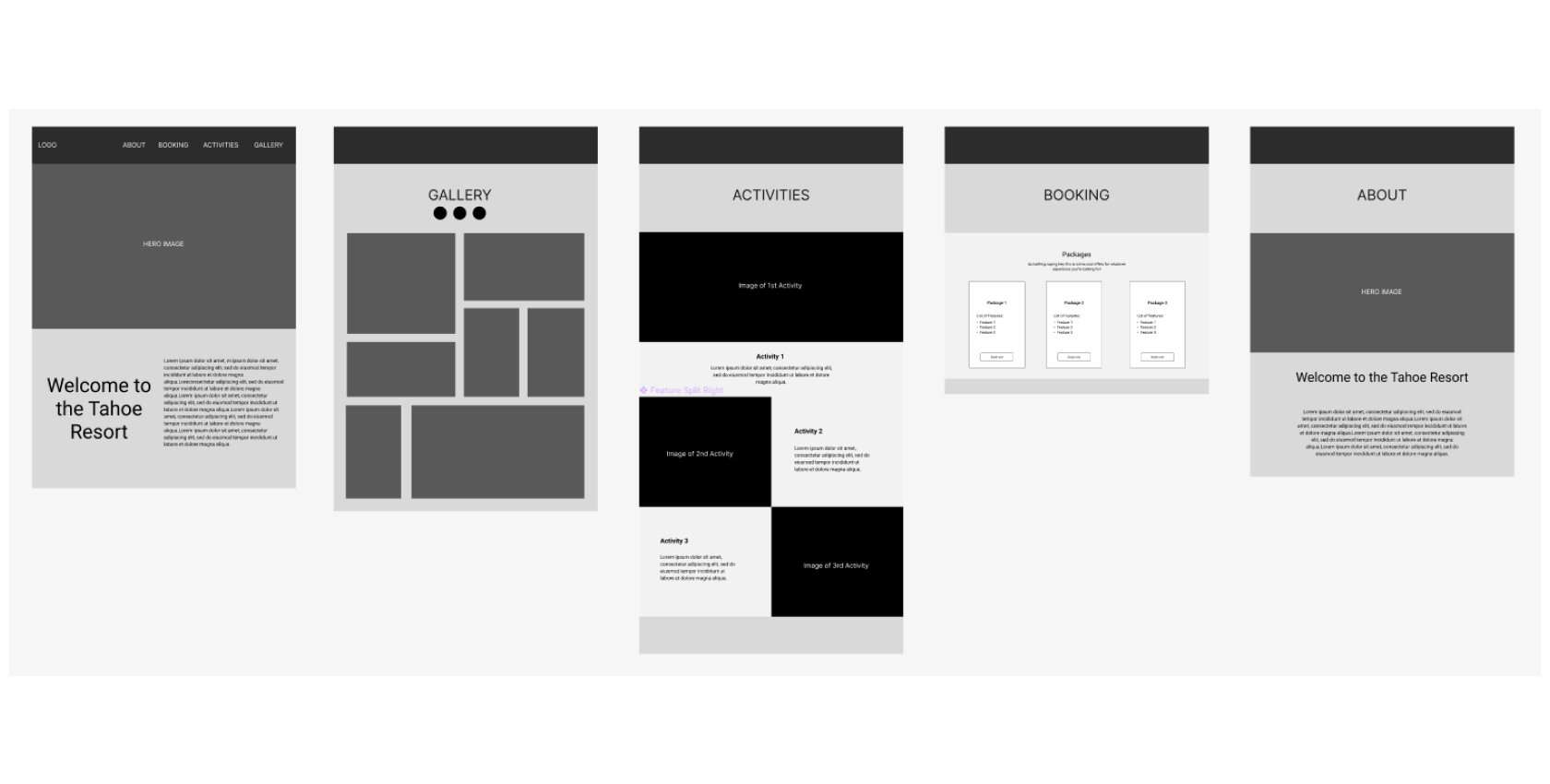
We started our layout planning by drafting a sitemap for our website. After agreeing on the sitemap, we each took a shot at wireframe sketches. Throughout the process, we developed ideas for what we wanted to include on the site (gallery, booking, amenities, etc). After drafting, we all chose which wireframe to move forward with (the starred image). We then proceeded with logo creation.
Logo Drafts:
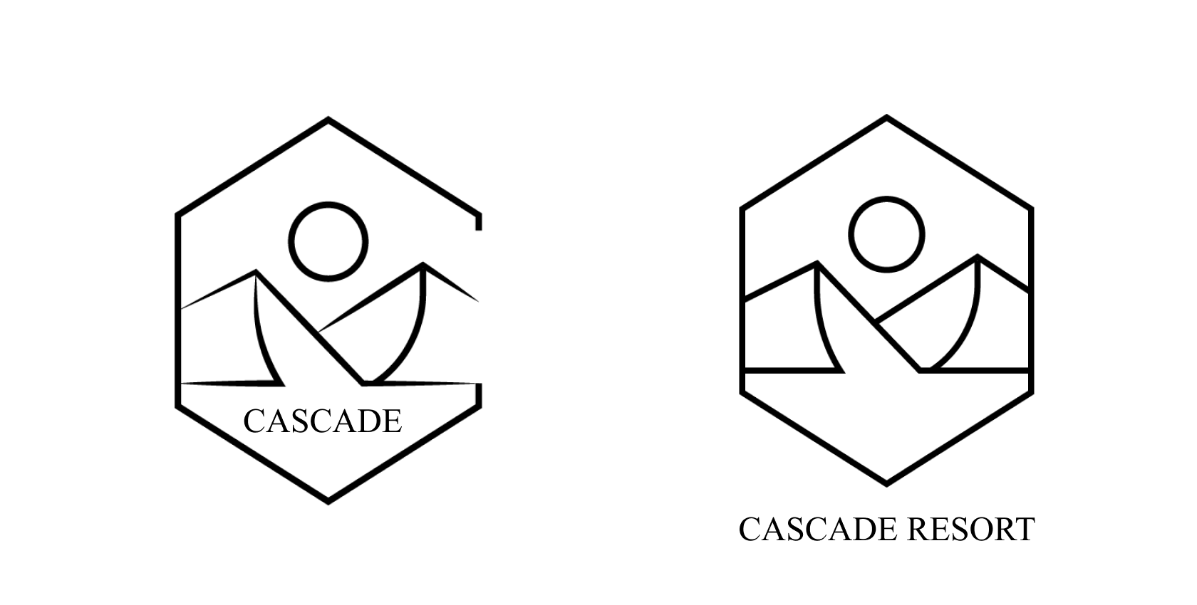
We each took a shot at drafting up some different ideas for logos. Through our explorations, we explored logo sketches with a symbol, typography, and a hybrid option. Before choosing Cascade Resort, we explored options for the name like Sierra Summit, Carnelian, and Agate Resort.
As we moved forward with Cascade Resort, we chose one of our thumbnail sketches and made our refinements. After exploring those, we moved forward with the best one and started work on our branding and style guide.
Branding and Style Guide
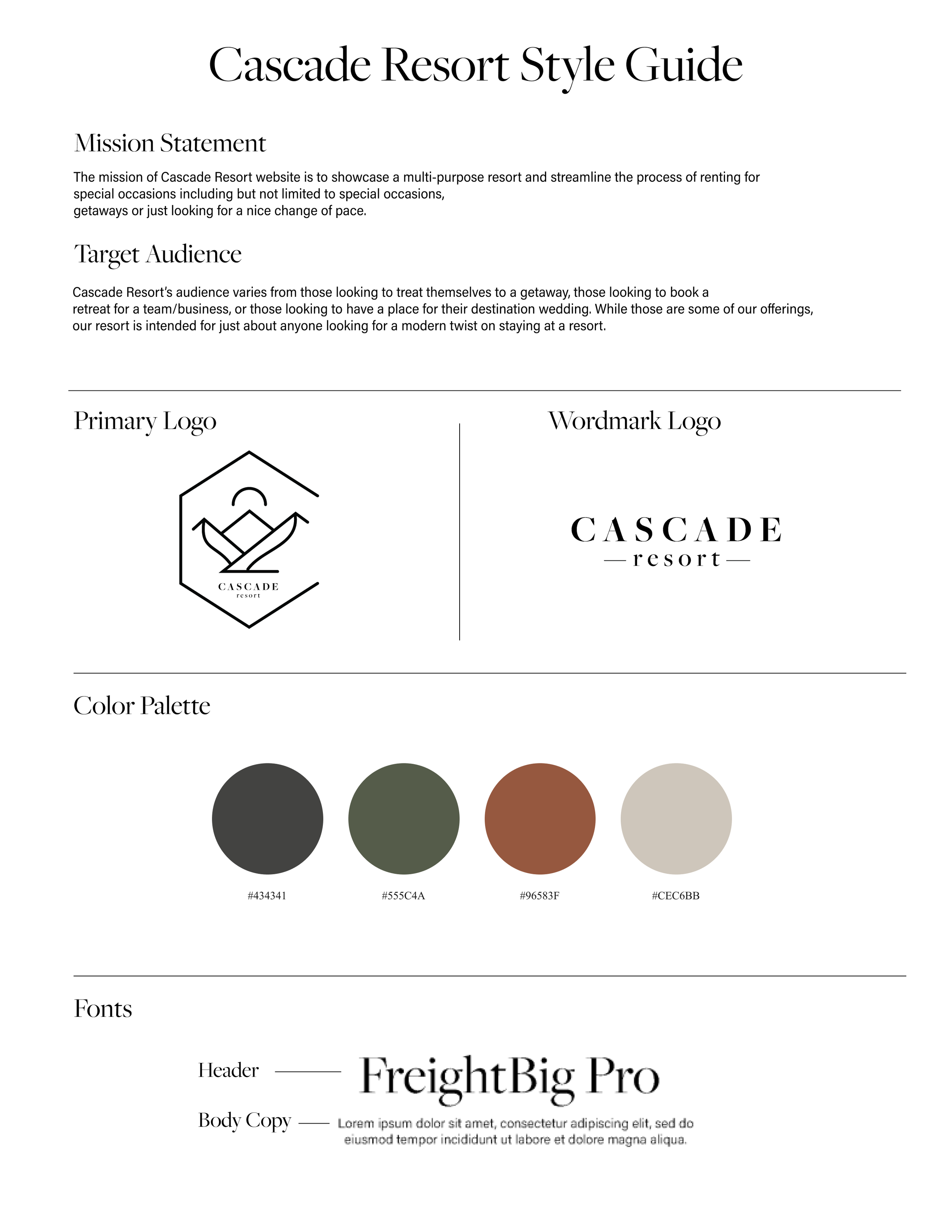
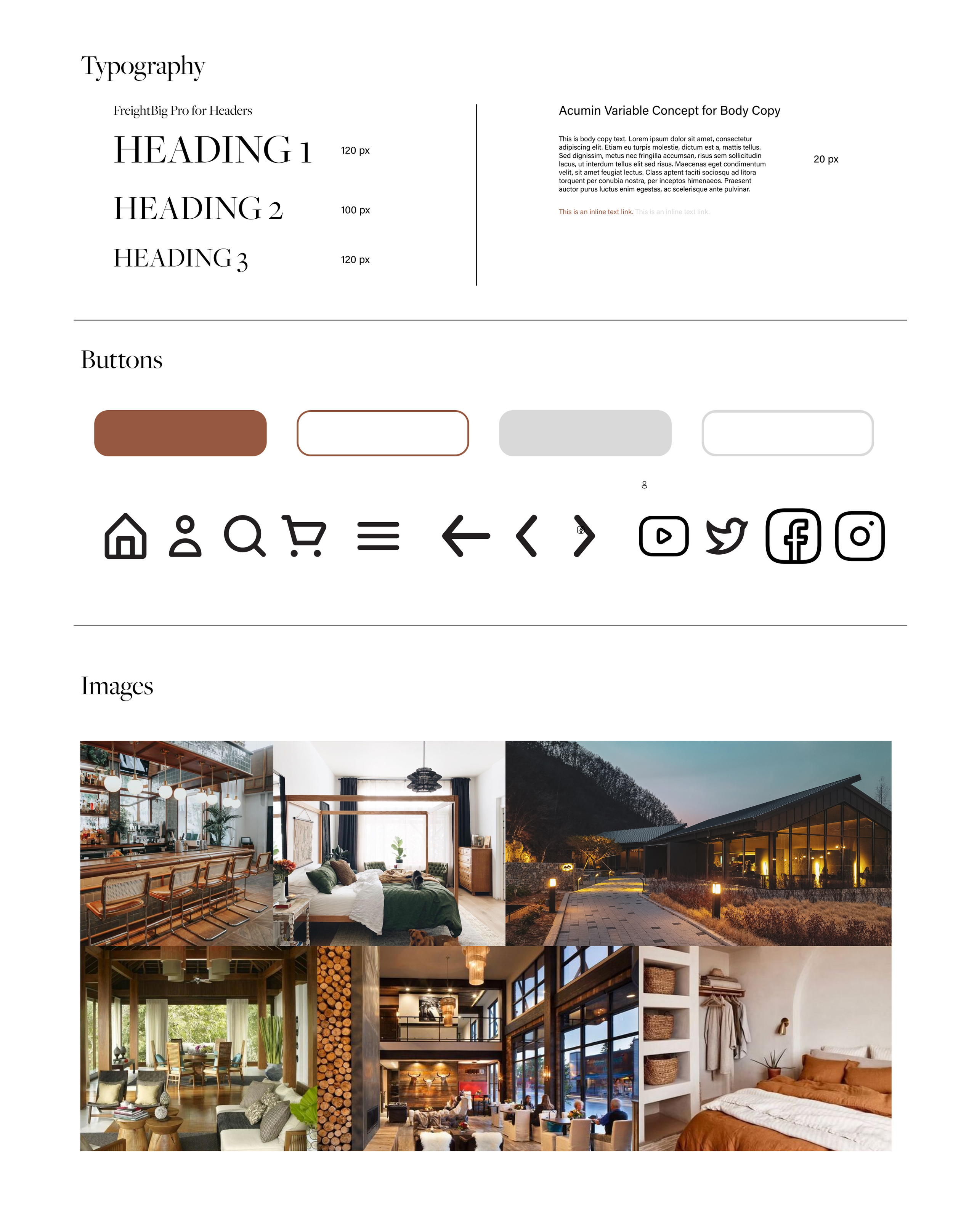
For our branding and style, we wanted a clean and modern aesthetic for our site. We decided on a color palette with a nice blend of earth tones and a clean feel. For our website, we wanted to keep things effective and clean - which played a part in our selection of elements, fonts, and icons. Here is the style guide below:

Final Iterations
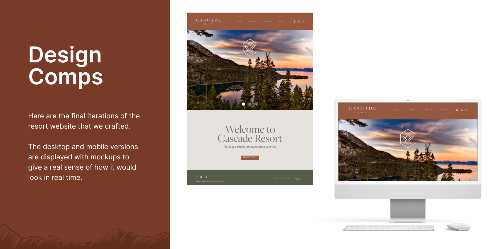
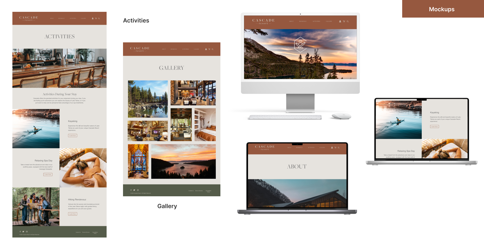
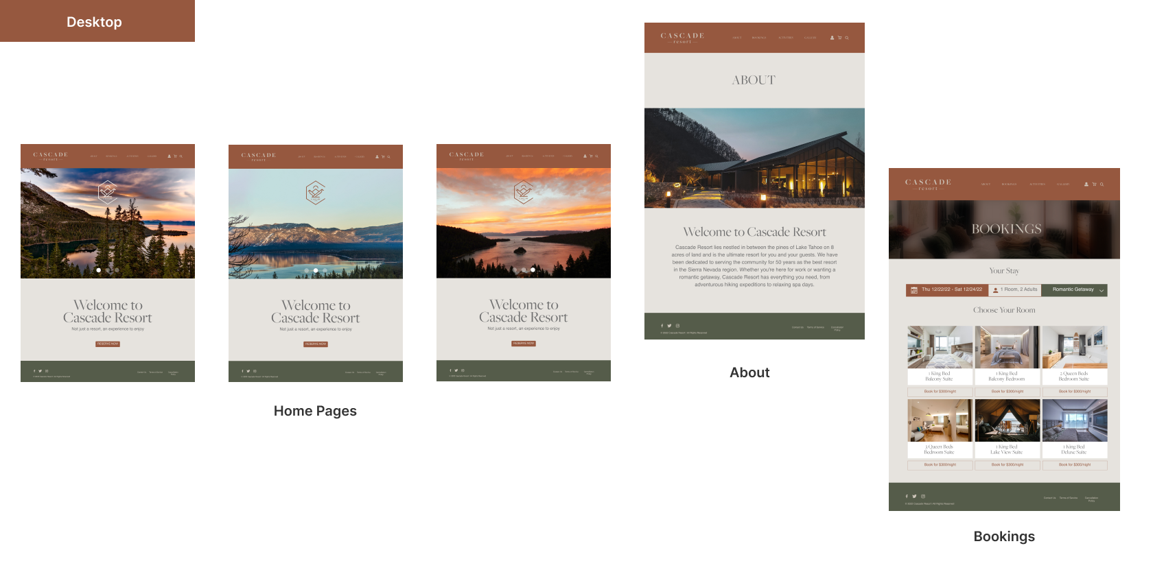
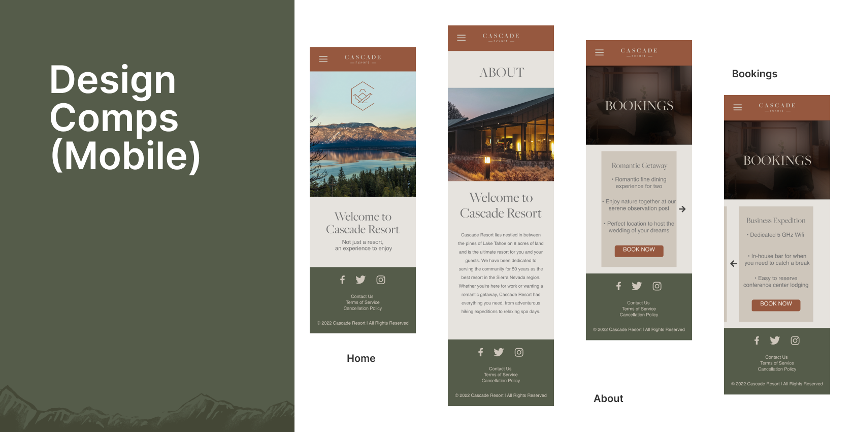
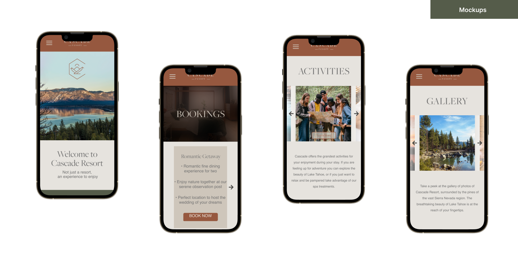
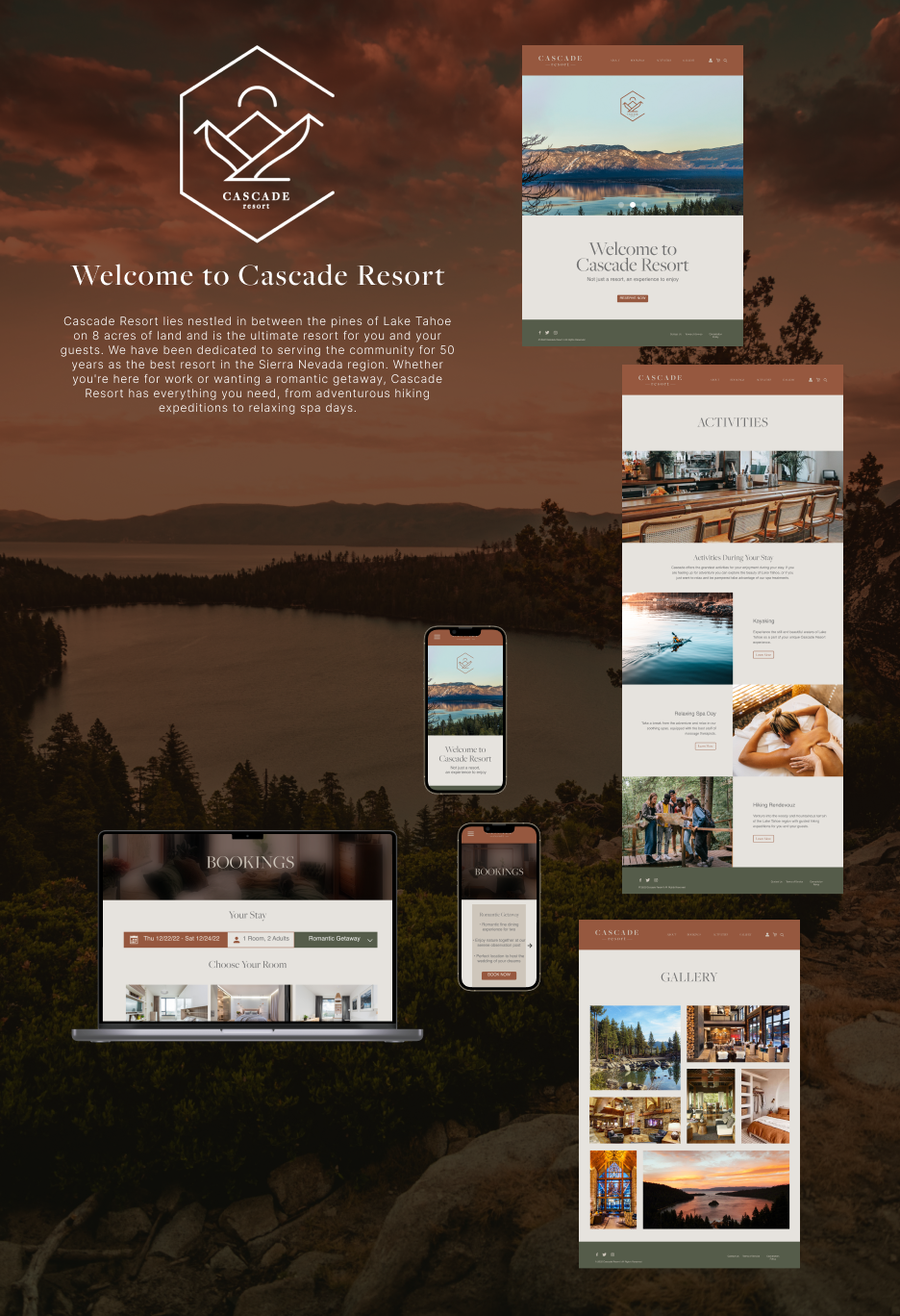
We moved to Adobe XD to build the website after finishing our planning in Figma. Part of our requirement for this project was applying our learnings with prototyping. As part of our requirements, we had to create a demo showcasing how the website functions. After doing a lot of testing, we came to a good place with our demo. Below are our final designs for both web and mobile formats:
Final Thoughts
It was great getting to work on this project with my group. This was one of the few times in my classes where I got to collaborate, and it helped that we were in previous classes before. It was great learning about working with Figma and Adobe XD while getting a good feel for web design. This project continued to peak my interest in venturing more into UX / UI!
